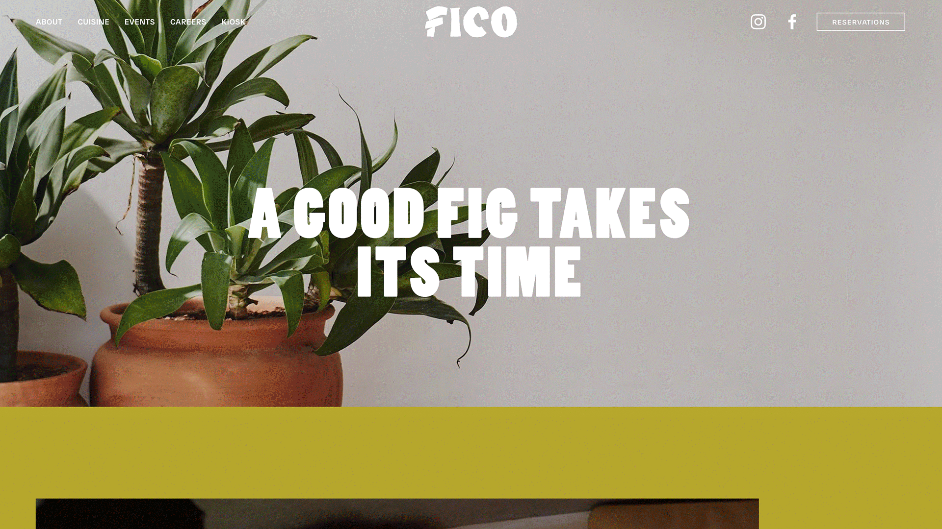


Fico
Give a Fig About Life
Fico began with a simple observation: even leisure has become fast.
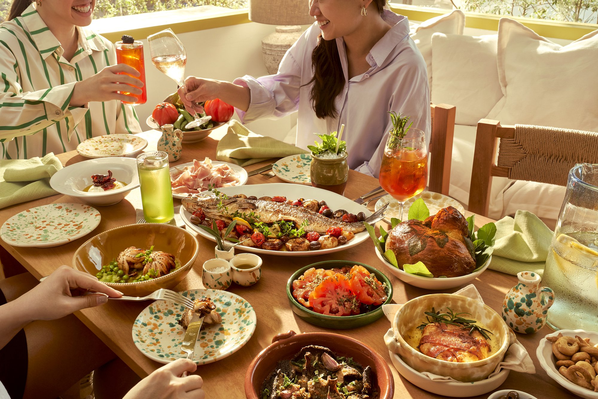
In a culture driven by productivity and speed, dining is often transactional. We positioned Fico as a counterpoint. Inspired by Italy’s slow movement, the restaurant was conceived around a behavioural shift—live better, not faster. The concept was not about recreating the Italian coast, but about translating its ethos into a contemporary Singapore context.
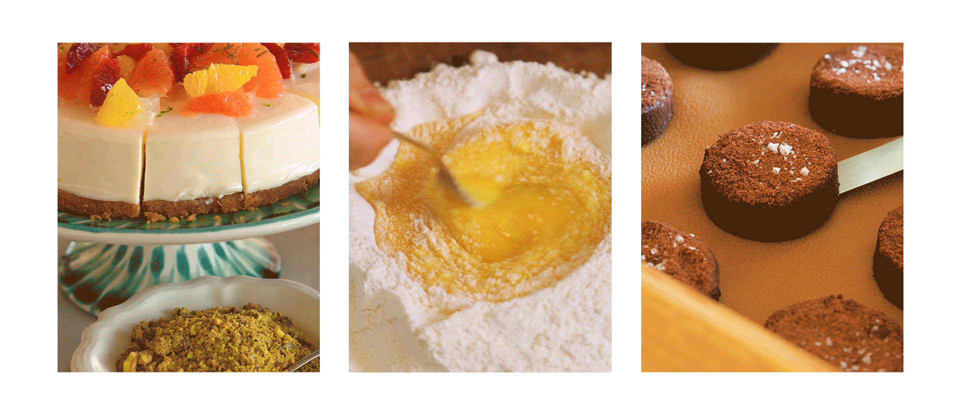
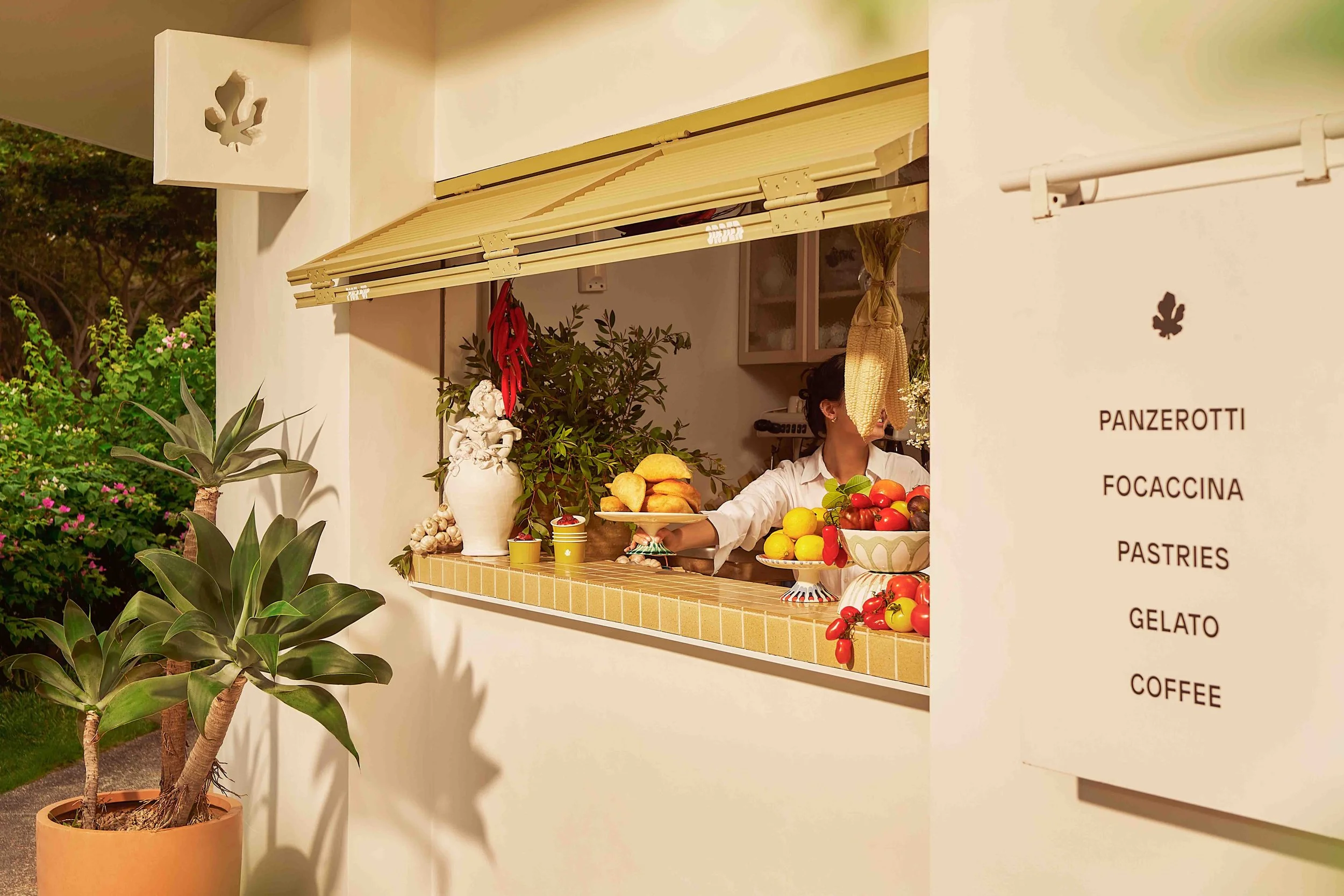
Designed by London-based studio Nice Projects, the space was designed to support conviviality and connection. An open kitchen and pasta counter dissolve the boundary between guest and chef, banquettes and communal seating encouraged long, languid meals. Partnerships with both Singaporean and Puglian makers inject pieces of local and Italian culture into the space. Custom lighting from Parisi 1876 sits alongside dining tables crafted from fallen local trees by Roger & Sons, embedding craft and locality into the experience.
Critically, the philosophy extended beyond brand and space into programming. A “Rent-A-Picnic” programme transformed Fico into a community anchor within East Coast Park. Guests could borrow curated picnic baskets and mats, extending the restaurant experience into the outdoors and reinforcing ritual over rush. Environmental stewardship was also embedded into the brand. “Pedal for Gelato” rewarded guests who cycled a minimum of 10km to Fico with complimentary gelato—aligning the slow living ethos with tangible sustainability action.
Fico shows how a clear cultural stance can shape every layer of a hospitality concept—from pitch to positioning, from identity to programming. The result is a restaurant with a distinct point of view, capable of sustaining relevance beyond trend cycles.
Concept Trailer
Have you noticed that time literally never stops working?
That clouds actually move a lot faster than we do?
That bougainvillea “petals” are actually… leaves?
That the hardest job in the world could be someone else’s hobby—as long as there is passion;
That plain rice is actually ever so slightly sweet, if you take the time to chew it.
Even plain water tastes pretty good, actually.
And damn, the air really is a little fresher nearer to the sea.
Imagine what else, if we all gave a fig about life?
The visual language was built to express this philosophy without defaulting to predictable Italian clichés. We developed a flexible identity system that balanced vibrancy with ease. The wordmark draws from the rugged cliff lines of the Puglian coastline. Bold and progressive, it signals vitality rather than nostalgia.
Abstract woven patterns were developed to represent craft—a nod to both Italian textile traditions and the value of passion embedded in the brand. Architectural portal motifs, inspired by Italian arches, were created to symbolise entry into a different rhythm of life. A vivid colour palette of chartreuse, Adriatic blue, park green and citrine further sets Fico apart from the canon of nonna-esque trattorias.

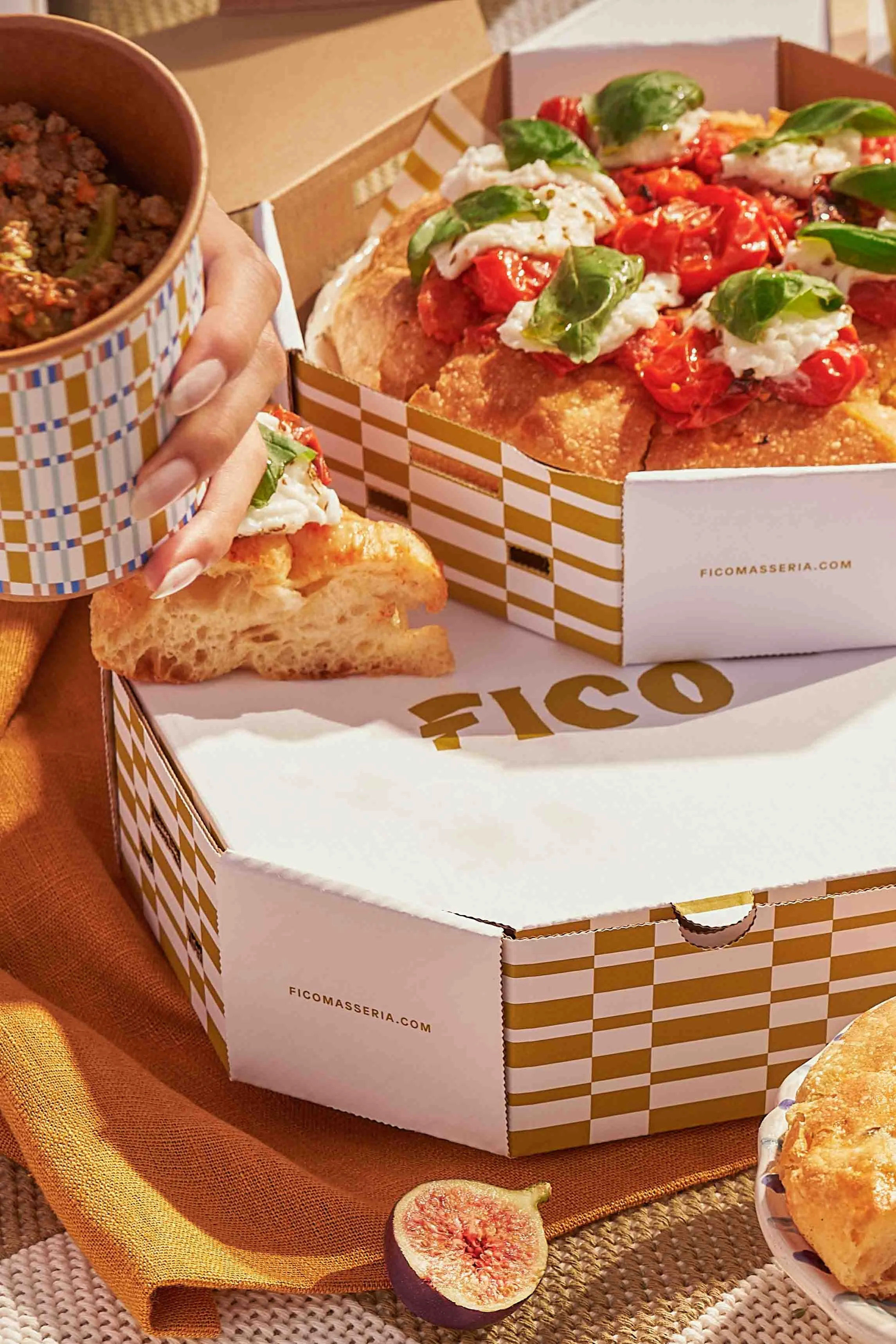
Focaccina Packaging
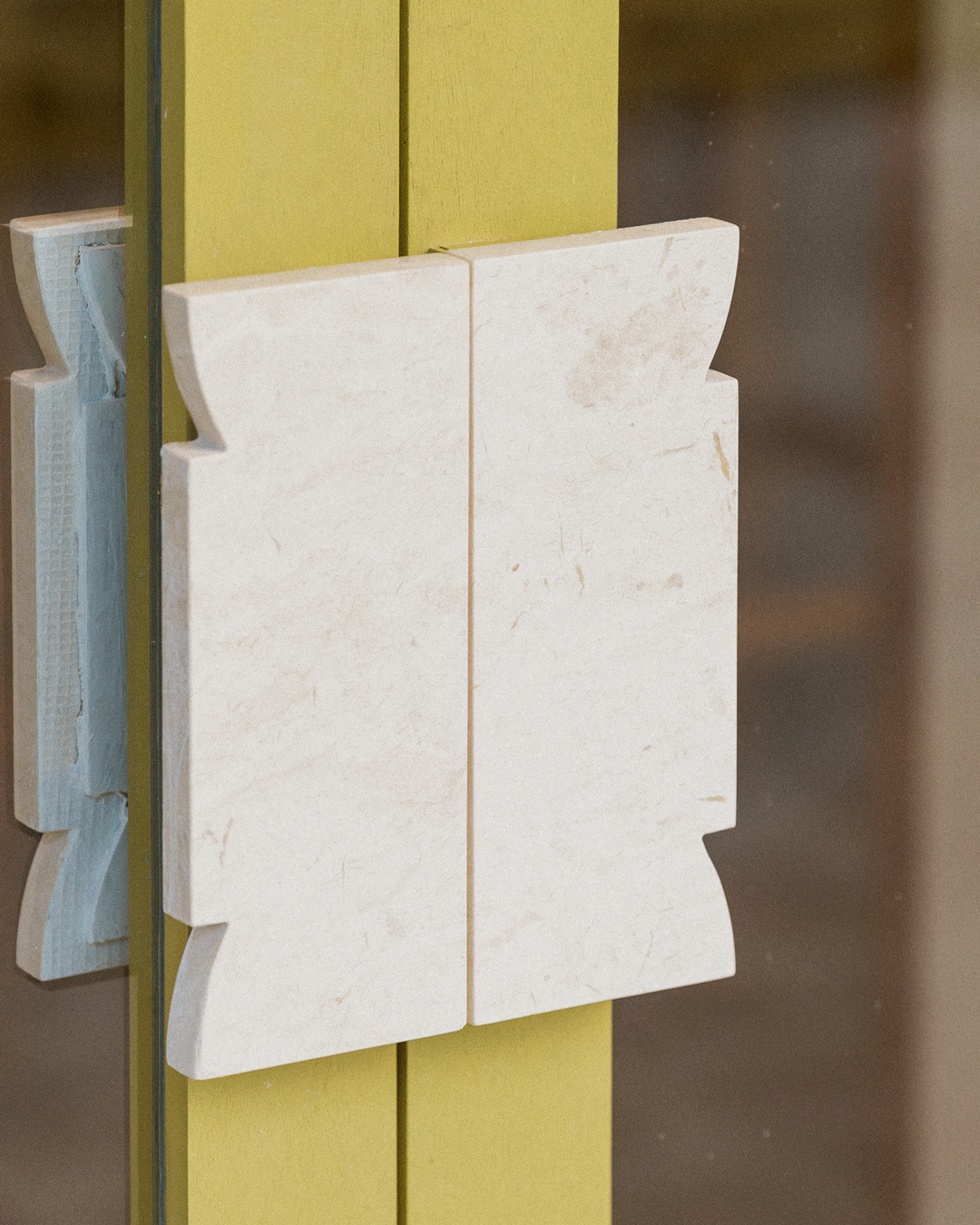
Custom Door Handle